These brand guidelines give you the tools you need to represent the International Fresh Produce Association appropriately in your efforts, regardless of the platform. We aim to be playful and authentic by including human touches that show a hands-on approach. Our expression system includes bold design elements that support IFPA's clear intent on taking action in the industry.
Logo Usage
Logo Family
The International Fresh Produce Association has a family of logomarks. These logomarks are a visual presentation of our character as an association: ready to act, take charge and lead.
This mark brings to life our clear sense of self: human, connected, progressive and brave. This collection allows flexibility while maintaining a consistent, modern, visual presentation of the brand.
Primary Logomark
The Primary Logomark emphasizes “Fresh Produce” to create a strong, recognizable wordmark.
The cornerstone of our brand mark is the seed. The seed is the foundation from which all living things grow and thrive. Like the seed, we breathe new life and give meaning to the brilliance and energy of the produce industry. This icon lives locked up with the logomark and is our most proprietary brand asset.
The preferred approach is to use the Primary Logomark when optimal space is available.
Alternate Logomark
The Alternate Logomark allows for optimal size and prominence when only vertical space is available.
![]()
Seed Icon
The Seed Icon lives locked up with the logomark but is also extractable and can be used on its own as a shorthand for the brand.

Proud Member Logo
The IFPA Proud Member Logo gives member companies an opportunity to display their pride in their IFPA Membership. This logo can be used on your company website, printed or digital collateral and/or email signatures.
All uses of this logo must adhere to the same rules as the general IFPA logo above.
Primary Logo
Full Color

The full-color Primary Logo should always live on a white background. This ensures the legibility of all parts of the logomark.
The full-color Primary Logo is made of 5 colors:
PMS 4287 C, PMS 1345 C, PMS 138 C, PMS 2254 C, PMS 7720 C
4287 C
1345 C
2011 C
2254 C
7720 C

Clear Space
To ensure proper legibility and brand presence, clear space should always be formed on all 4 sides of the Primary Logo using the ‘O’ of the wordmark at scale.

Minimum Size
Logo should never be scaled smaller than 2 inches in width to ensure legibility.
All elements of the logo should be included when scaling.
One Color
The one-color Primary Logo should always be white and live on PMS 556. This ensures legibility of the logomark and contrast between the letterforms and the background.
An alternative one-color version of the logo is available in black on a white background.

Alternate Logo
When horizontal space is limited, the alternative, stacked logo should be used. This logo will ensure proper legibility and brand presence on more vertical touchpoints.
The alternative logo follows the same color and clear space guidelines as the primary logo.


Minimum Size
Logo should never be scaled smaller than 2.2 inches in width to ensure legibility.
All elements of the logo should be included when scaling.
Seed Icon
The seed icon is our most recognizable brand asset. It has multiple uses within our logo lockup family but is also the foundation of our graphic look and feel.
Our seed shape is used to create graphic patterns, a branded photography holding shape and can be used as a single color sign off on product photos.
Full Color
The Seed Icon is created from 4 colors:
PMS 1345 C, PMS 138 C, PMS 2254 C, PMS 7720 C.
1345 C
2011 C
2254 C
7720 C

Clear Space
To ensure proper legibility and brand presence, clear space should always be formed on all 4 sides of the Seed Icon using the seed of the icon at scale.

Minimum Size
Icon should never be scaled smaller than a .25 inch in width to ensure legibility.
All elements of the logo should be included when scaling.

Approved Backgrounds
The full-color Seed Icon should always live on a white or PMS 556 background.
One-color white Seed Icon should always live on a product photo in the bottom right-hand corner.
Primary Logo Misuse

Don't Scale individual elements separately.

Don't change the orientation of any element.
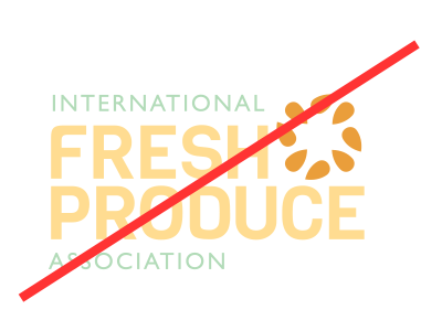
Don't change the color of any individual element.

Don't apply drop shadows or effects.

Don't place over photography.
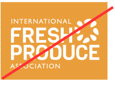
Don't apply one-color logo to any background other than PMS 556.
Brand Icon Misuse

Don't scale individual elements separately.

Don't change the orientation of any element.

Don't apply drop shadows or effects.
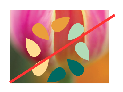
Don't use full-color icon on photography.

Don't enlarge or crop icon over photography.
Icon must live in bottom right-hand corner to not obstruct image.

Don't apply one-color icon to any background other than PMS 556.
Color Palette
Our color palette captures the duality of our brand character: Natural vibrancy combined with credibility and strength.
The color balance pie chart illustrates the correct balance of the primary and secondary
palettes. The primary palette should be used most often on graphic touchpoints heavily relying on white as a background color to create a clean modern layout.
white
CMYK: 0 0 0 0
RGB: 255 255 255
HEX: FFFFFF
PMS 2011 C
CMYK:7 42 89 0
RGB: 232 157 59
HEX: E89D3B
PMS 2254 C
CMYK: 31 0 34 0
RGB: 173 224 188
HEX: ADE0BC
PMS 1345 C
CMYK: 0 13 50 0
RGB: 252 209 146
HEX: FCD192
PMS 2455 C
CMYK: 45 11 37 0
RGB: 143 189 171
HEX: 8FBDAB
PMS 4287C
CMYK: 66 62 55 54
RGB: 67 64 67
HEX: 434043
PMS 7720 C
CMYK: 95 6 50 46
RGB: 0 99 95
HEX: 00635F

